This is a working document to expand on ideas and themes we should explore in our design manifesto and core values. Please note that at this stage, they are in no particular order.
Powerful but intuitive
OpenProject is a complex, powerful tool. One of its key strengths its customisability and its ability to adapt to a range of different needs. It offers users a high level of control and advanced features to allow them to tailor the tool to their needs. This includes complex filtering options, custom statuses, custom fields and a range of work package options.
Nevertheless, it is very important for ensure that OpenProject is intuitive for new users who might not necessarily need that complexity, or indeed be overwhelmed by it.
Our design approach to deal with striking the right balance between making something powerful versus making something easy to use is to have a two-tiered approach: apply sane defaults by standard via an intuitive and straightforward view, but allow advanced users the option (accessible via an additional click) to dig deeper and customise should they wish to.
Desktop-first
OpenProject is not primarily designed for mobile use or with a mobile-first approach, despite the software adapting fairly well to smaller screens in most cases. The majority of features and views are designed to take advantage of a larger screen and more complex interactions (including keyboard shortcuts).
However, we recognise that certain features are particularly adapted to and are useful in a mobile context. These might include accessing notifications on the go, viewing work package contents. viewing and responding to comments and changing a work package attribute. These features will be given particular attention to make sure they are optimised for mobile use.
We consider project planning, scheduling and organisation to not be priority use cases on mobile.
The UX of Open Source
OpenProject has evolved considerable from the time it forked off ChiliProject and Redmine. As an open source project with a considerably long history and a large number of contributors, it still has parts that could be considered "legacy", or parts that have evolved at different paces. There are also similar components that are implemented somewhat differently in different parts of the software. This is quite normal for a large open-source project.
One of the goals of the design system is to introduce more coherence and bring the design up to date. Ideally, we would be able to update everything at the same time and push the new design system to the entire software; nevertheless, we recognise the need for a more pragmatic approach. The design system will be rolled out in phases, with a careful study of the consequences of updating each component or UI token, and the potential dependencies that will be affected.
We recognise that UI/UX has not always been the highest priority for open-source projects and is often neglected, which is somewhat understandable given how open source projects have relatively fewer resources dedicated to it than commercial products. Our goal is to do our part to improve that situation as much as we can, and document our process in the hope that it might help other open source projects looking to implement their own design system.
Accessibility
Try to support contrasts, font sizes, screen reader compatibility
Vision, Auditory Sense, Motor Function and Cognitive Ability
Localisation and internationalisation
We work English-first and then work on translations
Let the community participate in the localisation too?
Make sure design decisions are not taken with only English in mind (in terms of text length, writing direction?)
Design Values
Provide designers with internal standards for evaluation, enlighten and inspire the design principles and design patterns, and then offer guidance and general solutions for specific design problems.
Natural
Certain
Meaningful
Scalable
Intuitive
...
Branding
Basic explanation an resources on the branding of OpenProject (logo, colours, typo, iconfont...)
Brand family (BIM...)
Voice, language and tone
Definition of the tone and voice used in our products that can be used in multiple languages.
Usage of acronyms, terms, file names, folders, lists, person and pronouns, titles, capitalisation...
Usage of numbers: ages, dates, years, numerals, fractions...
The power of this Design System
Short introduction and points on whats the main advantages of the Design System (consistent, empowering, reusable, scalable, install and go...)
The products and platforms
Which products and platforms are using currently the DS
A reusable component using maintained by OpenProject that extends Primer.
It is developed and tested in the primer_view_components fork to get all benefits of the primer test suite (accessibility, performance, visual differences).
| --------- | --|
| my page | |
| my time tracking | |
| activity ||
| work packages (list) ||
| work package (detail) ||
| gantt charts ||
| team planners (list) ||
| team planner (show) ||
| boards (list) ||
| board (show) ||
| board configuration modal ||
| board filters ||
| meetings (list) ||
| news (list) ||
| news (show) ||
| news (edit) ||
| time and costs (new cost report) ||
| time and cost filters ||
| export xls dialog ||
| export pdf timesheet dialog ||
| my time tracking ||
| activity ||
| work packages (list) ||
| work package (detail) ||
| gantt charts ||
| team planners (list) ||
| team planner (show) ||
| boards (list) ||
| board (show) ||
| board configuration modal ||
| board filters ||
| meetings (list) ||
| news (list) ||
| news (show) ||
| news (edit) ||
| time and costs (new cost report) ||
| time and cost filters ||
| export xls dialog ||
administation
| --------- |
| overview ||
| users and permissions | |
| users (list) ||
| user (edit) ||
| general ||
| projects ||
| groups ||
| global roles ||
| notification settings | |
| email reminders ||
| rate history ||
| avatar ||
| two-factor authenticat|ion |
| work packages ||
| projects ||
| custom fields ||
| attribute help texts ||
| calendars and dates ||
| system settings ||
| emails and notificatio|ns |
| api and webhooks ||
| authentication ||
| announcement ||
| design ||
| colors ||
| enterprise edition ||
| time and costs ||
| backlogs ||
| github integration ||
| documents ||
| files ||
| plugins ||
| backup ||
| information||
A design system is an invaluable tool to any team of designers and developers. It does not have to be a complicated, convoluted system; in fact, at its most basic level, it is simply necessarily documentation at a design level.
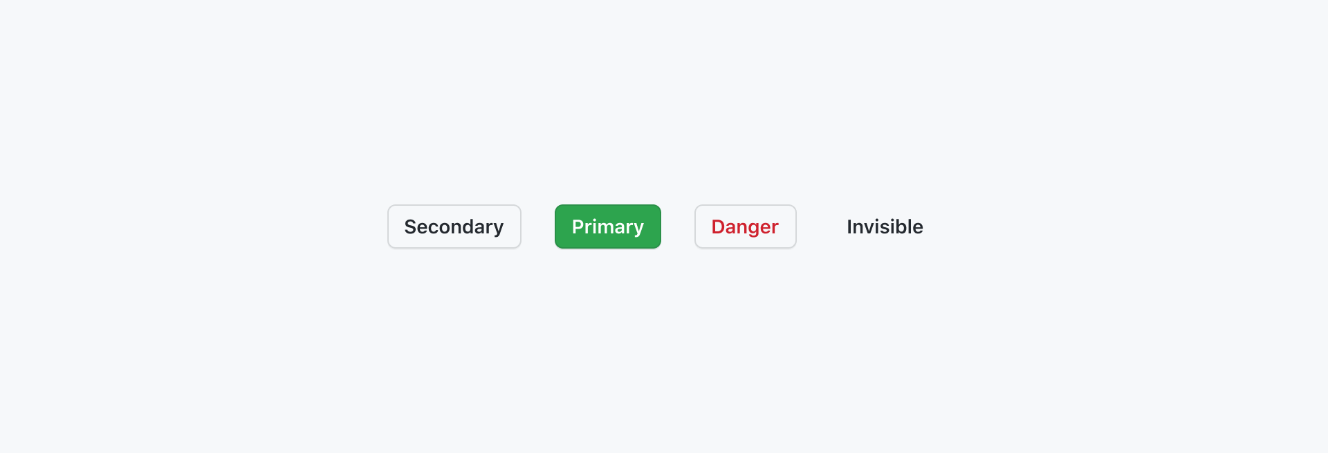
Each design component -- a button, a dialogue box, a checkbox, a drop-down list -- has certain properties and variations. These need to be documented and specified somewhere, so that each time it is used:
- the design team can use it in future designs to maintain consistency
- the dev team knows how it should behave, without having to re-define its behaviour each time it is used
- the QA team can verify that the implementation corresponds to specifications
This is crucial to maintain consistency and avoid having multiple implementations of similar elements, which adds both design and development overhead. While the design team has started working on components and defined variations, no design component is properly specified today. Today, the dev and QA team need specifications per work package or per feature, and each new one can potentially include clarifications, modifications and variations.
Today, there is no documentation on how any design component should act or behave, a "single point of truth" that any designer, dev or QA person can look into. There are no ways to define variations over time, and therefore no way to have an existing component evolve over time to cover different needs.
Not having this documentation, this single point of truth, translates to a lot of time spent on communicating between designers and devs, a lot of effort to come to a common understanding and even more time spent in the future when trying to understand design decisions taken in previous discussions. The lack of proper documentation is not only inefficient but expensive and time-consuming.
At its most basic form, this is the problem the design system seeks to solve. It allows a team to work more efficiently across the design and development cycles. Planning, mockups, coding, and QA become cheaper and faster.
As we work on new features and optimisations, which we are already doing, we need to document these changes and behaviours somewhere. The design system, at its most basic form, doesn't have to much more than simply these necessarily specifications and documentation that facilitates communication between the design and dev teams.
In its smallest form for the first iteration, the design system is simply a common base shared between the design and dev teams with work and time that both teams are doing anyway each time a new feature is worked on. It is a necesasry a common base that reduces that effort both teams spend when working on future features and optimisation.